A Guide to Flexbox
Have an Idea on CSS Flexbox

MERN Stack Developement Enthusiast
CSS Flexbox
Flexbox in **CSS **is a way to align items in rows or columns. Flexbox is one dimensional unlike CSS Grid which is two demensional.
How it works?🤔
A flex container has flex-items in it, which can expands flex-items to fill the available free space in the direction which might be either row-direction or column-direction. If the items cannot fit into the available space then the items will go to the nextline in the container or shrinks in the same line.
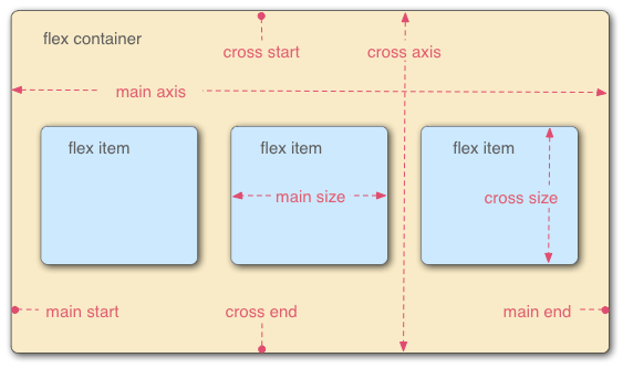
The basic overview layout of Flexbox is shown in the following figure,
The Basic Terminalogies we should know before going to use Flexbox are:
**👉 main-axis : ** The main axis of a flex container is the primary axis along which flex items are laid out.
**👉 main-start | main-end : ** The flex items are placed within the container starting from main-start and going to main-end in main-axis.
**👉 main-size : ** A flex item’s width or height, whichever is in the main dimension, is the item’s main size.
**👉 cross-axis: ** The axis perpendicular to the main axis is called the cross axis. Its direction depends on the main axis direction.
**👉 cross-start | cross-end : ** The flex items are placed within the container also starting from cross-start and going towards the cross-end in cross-axis.
**👉 cross-size : ** A flex item’s width or height, whichever is in the cross dimension, is the item’s cross size.
Let's now discuss some of the flexbox properties along with thier values,
    display: flex; /* or inline-flex */
    flex-direction: row | row-reverse | column | column-reverse;
    flex-wrap: nowrap | wrap | wrap-reverse;
    justify-content: flex-start | flex-end | center | space-between | space-around | space-evenly | start | end | left | right;
    align-items: stretch | flex-start | flex-end | center | baseline | first baseline | last baseline | start | end | self-start | self-end;
    align-content: flex-start | flex-end | center | space-between | space-around | space-evenly | stretch | start | end | baseline | first baseline | last baseline;
      /* GAP */
    gap: 10px;
    gap: 10px 20px; /* row-gap column gap */
    row-gap: 10px;
    column-gap: 20px;
display: flex The flex property sets the flexible length on flexible items. Note: If the element is not a flexible item, the flex property has no effect.
*Syntax: *
.container {
        display: flex;
      }
Example :
flex-direction : The flex-direction property allows you to change the direction of the flex-items in either row-direction or in column-direction. By default, the flex-direction is laid toward the flex-containers main-axis which is row-direction here in our case.
*Syntax: *
.container {
        display: flex;
        flex-direction: column /* by default the flex-direction is row */
      }
Example :
flex-wrap : The flex-wrap CSS property** sets whether flex items are forced onto one line or can wrap onto multiple lines.** If wrapping is allowed, it sets the direction that lines are stacked.
*Syntax: *
.container {
        display: flex;
        flex-wrap: wrap /* the values can also be nowrap and wrap-reverse */
      }
Example :
justify-content : The CSS justify-content property defines how the** browser distributes space between and around content items along the main-axis of a flex container.**
*Syntax: *
.container {
        display: flex;
        justify-content: center; /* the values can also be  flex-start | flex-end | space-between | space-around | space-evenly | start | end | left | right */
      }
Example :
align-items : The CSS align-items property defines how the browser distributes space between and around content items along the cross-axis of a flex container.
*Syntax: *
.container {
        display: flex;
        align-items: center;  /* the values can also be stretch | flex-end | flex-start| baseline | first baseline | last baseline | start | end | self-start | self-end */
      }
Example :
align-content : The CSS align-content property sets the distribution of space between and around content items along a flexbox's cross-axis or a grid's block axis.
*Syntax: *
.container {
        display: flex;
        align-conten: start;  /* the values also can be flex-start | flex-end | center | space-between | space-around | space-evenly | stretch |end | baseline | first baseline | last baseline */
      }
Example :
gap : The gap property in CSS is a shorthand for row-gap and column-gap , specifying the size of gutters, which is the space between rows and columns within grid, flex, and multi-column layouts.
*Syntax: *
.container {
        display: flex;
        flex-direction: row;
        gap: 15px;  /* the values also can be gap | row-gap | column-gap */
      }
Example:
Want to learn more about CSS Flexbox Check here and here


