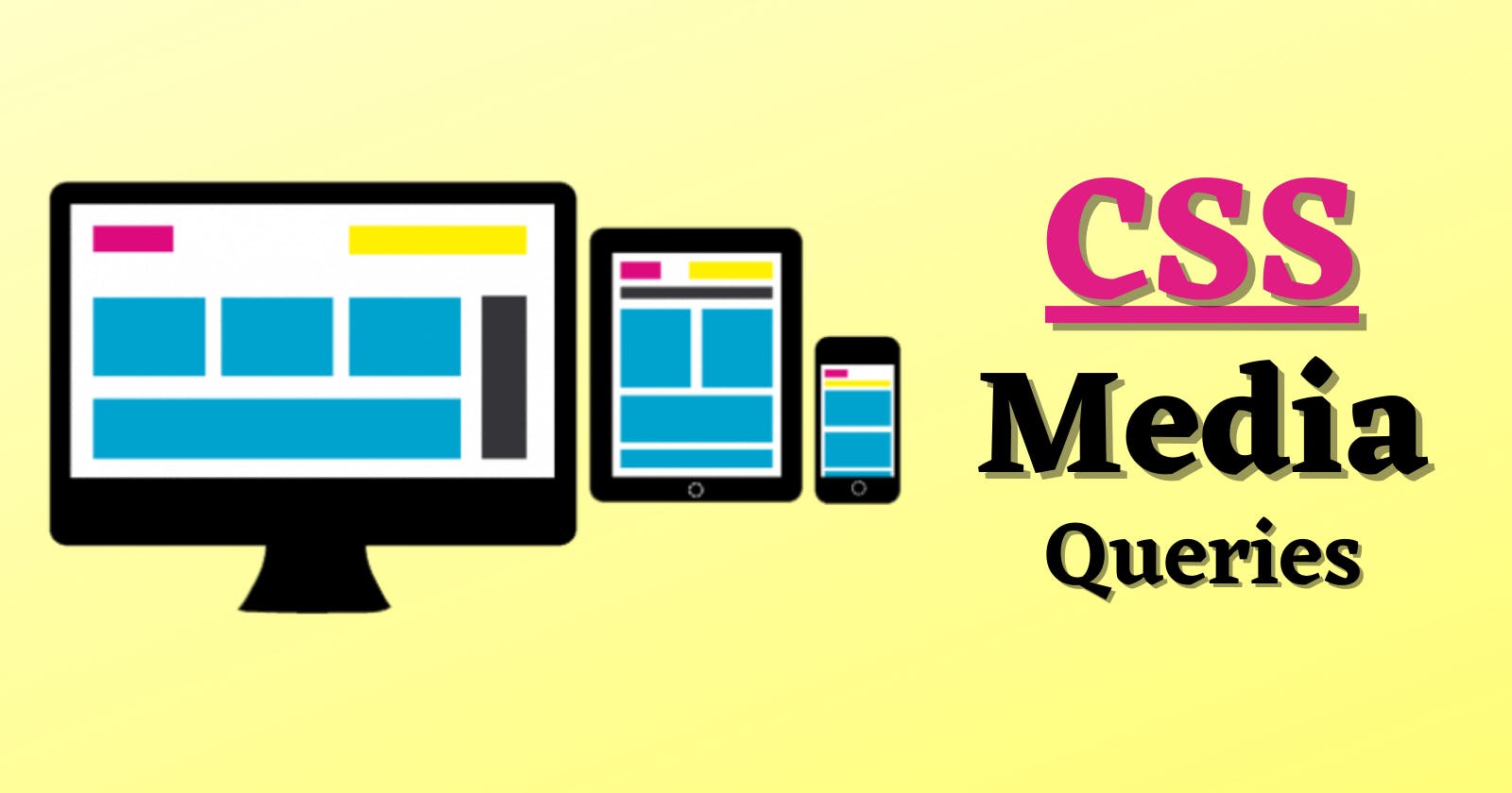
What is a Media Query in CSS ?
Media query is a CSS technique used in CSS.
It uses the @media rule to include a block of CSS properties only if a certain condition is true. Media queries are a key part of responsive web design, as they allows you to create layouts depending on the device viewport and the environment your site in running on
Need for Media Queries ?
When the web was first introduced, website were made particularly to run on **Desktop Browsers **which had wider length of screens. The website were only fit into the desktops screen. As the time passes and technology started to grow, mobile phones and tablet devices were introduced and people started using mobile phones and tablets more than Desktop Computers. Because Mobile Phones and Tablet Devices are more portable than desktops. Now the problem is, the websites which were created to run on desktop browsers are not able to run on Mobile phones and tablets browsers, because mobile phones and tablets Screens are smaller as compared to Desktop Screens. That's where the concept of Media Queries comes in handy. Media Queries allows us to create website layout according the device width. This is what we called as Responsive Web Design (RWD) in Great Terms.
Let's see the stucture and usage of Media Queries :
The simplest media query syntax looks like this:
  /* CSS rules go here */
}```

It consists of :

- A media type, which tells the browser what kind of media this code is for (e.g. print, or screen).
- A media expression, which is a rule, or test that must be passed for the contained CSS to be applied.
- A set of CSS rules that will be applied if the test passes and the media type is correct.

### Media types

The possible types of media you can specify are:

- all
- print
- screen

we can simply use ```
@media(media-feature-rule){}
``` without specifying any other media types because, by default the media type is set to **all**.
So, you can **omit **specifying the media type.

Let's see a simple example on media queries :

The following media query will only set the body to ```
color: red
``` if the page is printed. It will not apply when the page is loaded in a browser.
@media print { body { color: red; } } ```
Media feature rules
After specifying the type, you can then target a media feature with a rule. A Media feature rule can be used to check many things, such as: width and height of the viewport — using the min-width, max-width, and width media features.
In practice, using minimum or maximum values is much more useful for responsive design so you will rarely see width or height used alone.
These feature rules are used to create layouts that respond to different screen sizes. For example, to change the body text color to orange if the viewport is exactly 760pixels, you would use the following media query.
@media(max-width: 760px) {
  body {
    color: orange;
  }
}
max-width : The max-width(short form of maximum width) property is used, when we want to target a specified width of screen and apply all of our CSS styles upto that width.
min-width : The min-width(short form of minimum width) property is used, when we want to apply styles starts from a certain width and keep on applying them to the certain width.
Let's see the practical example on max-width and min-width :
Example :
If we notice the above shown example, we have heading and a paragraph. Here, we have set a media query rules for body to change its color: The color of the body would be "pink" upto the maximum width of 768px. Once the screen goes up to the 768px i.e; 769px the body color will become "grey"
**Break point : ** We often hear the term Break point in CSS. CSS breakpoints are points where the website content responds according to the device width, allowing you to show the best possible layout to the user. CSS breakpoints are also called media query breakpoints, as they are used with media query.
From the above example we can say that, 768px and 769px are the break points.
**Break points in CSS for different screen sizes : **
320px — 480px: Mobile devices.
481px — 768px: iPads, Tablets.
769px — 1024px: Small screens, laptops.
1025px — 1200px: Desktops, large screens.
1201px and more — Extra large screens, TV.
Orientation
One well-supported media feature is orientation, which allows us to test for portrait or landscape mode. To change the body text color if the device is in landscape orientation, use the following media query.
@media (orientation: landscape) {
  body {
    color: blue;
  }
}
Example :
Conclusion :
Want to learn more about CSS Media Queries ?
Check Here and here
Thanks for reading the article 🤗
Happy Learning :)


